Brand-forward web design
Designing sites that feel distinctive, editorial, and aligned with the client instead of looking like another recycled template.
I founded Carter Creates in 2020 and now serve as partner at Joseph Carter Group, where I lead design, front-end development, photography, and the visual side of turning ideas into public-facing experiences. My work sits between brand presence and actual execution.

I like building sites and brand systems that feel clear, expressive, and polished, but still easy to use. The goal is always a better experience, not extra ornament.
I care about the emotional read of a site, but I also care about how it performs when someone needs to update it, book through it, or trust it in the first 10 seconds. That mix is what keeps the creative work grounded.
Designing sites that feel distinctive, editorial, and aligned with the client instead of looking like another recycled template.
Taking layouts from idea to shipped experience, with responsive behavior, visual consistency, and real-world usability in mind.
Creating imagery and supporting content that helps a site feel lived-in, credible, and more personal than stock-heavy alternatives.
Building reusable patterns so the client's brand can stay consistent across pages, launches, campaigns, and future updates.
The specifics of the work changed over time, but the core instinct stayed the same: build something people can feel, understand, and remember.
In 2020, Carter Creates became the platform for photography, visual identity, and the kinds of digital assets that help a person or brand feel polished in public. That studio foundation still shapes how I think about craft and client service.
The common thread across these examples is intentional presentation. Each project needed a stronger visual story, a cleaner site experience, or both.
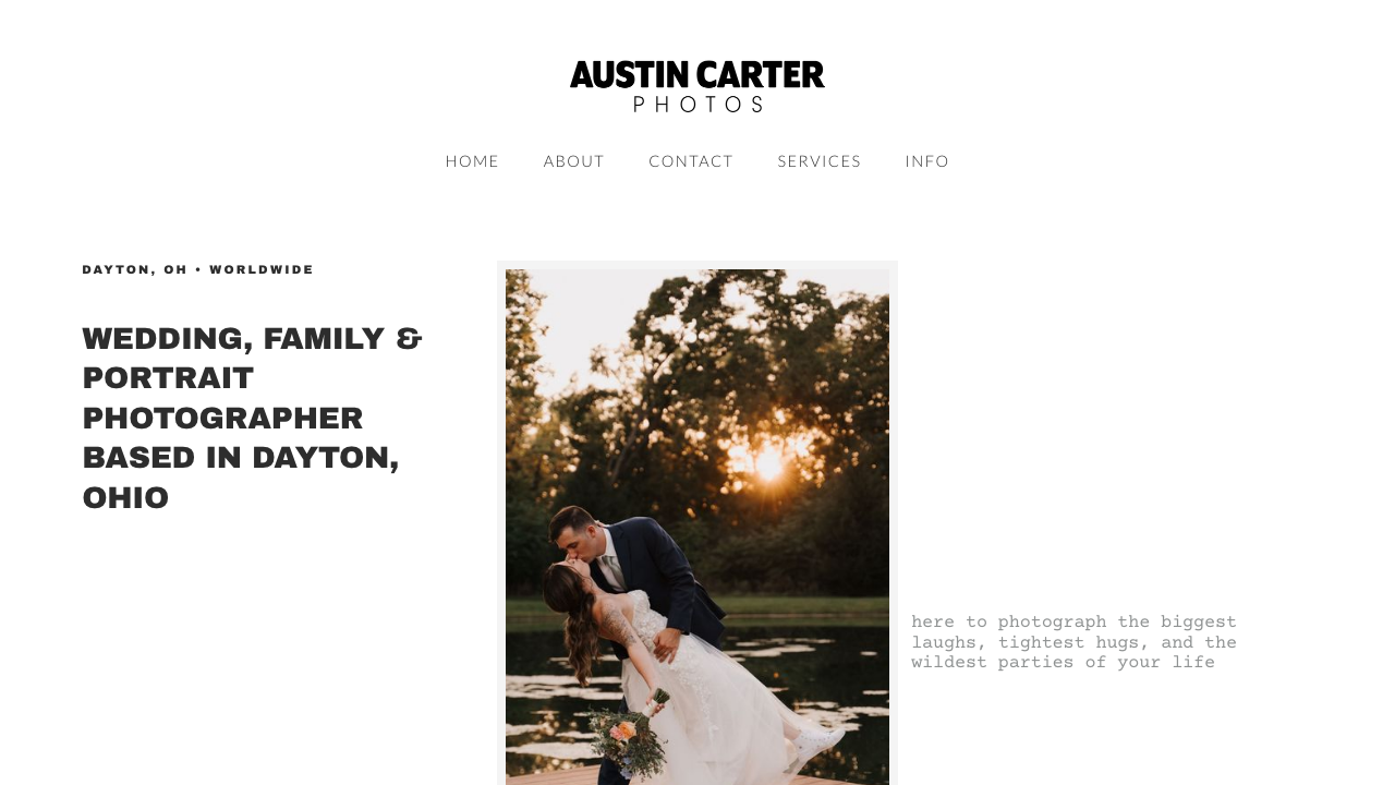
A visual portfolio site designed to feel both personal and client-ready, with strong imagery and a cleaner booking path.
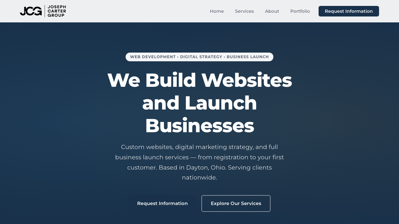
A service-business site with a sharper visual system, clearer content rhythm, and more modern founder presentation.
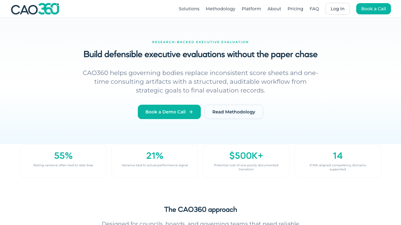
Design and digital presentation work that helps a more specialized platform feel cleaner, clearer, and easier to trust.
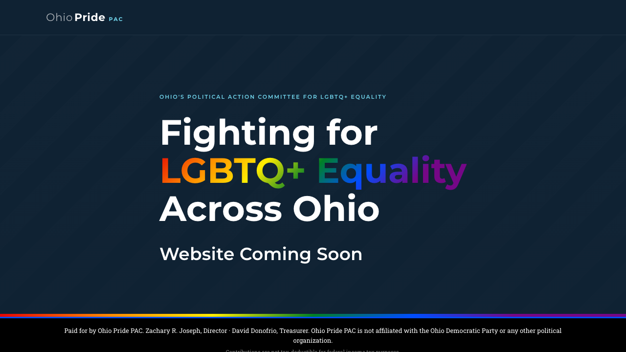
A site with stronger visual atmosphere and clearer organization for a public-facing statewide audience.
I am drawn to design that has atmosphere and point of view, but not at the expense of clarity. The best output feels expressive the first time you see it and obvious to use the second time.
Typography, spacing, imagery, and color should all reinforce the same message instead of competing with each other.
The work has to hold up on phones, tablets, and desktop so the design does not collapse the moment a user leaves a large screen.
Original photography and stronger visual direction help a brand feel specific, trustworthy, and far less replaceable.
I care about making the page feel good, but I also care about whether the user understands where to go next.
I like work that feels designed, but never precious.
The strongest projects are the ones where visual quality, technical execution, and practical client needs all respect each other.
Zach's profile covers the operations, systems, and go-to-market side of the partnership. Together, the two pages explain how JCG blends founder strategy with creative execution.