Keep the JCG shell consistent.
The primary logo, navigation, footer system, and overall tone remain shared across the site. The services area should feel refreshed, not detached.
This page keeps the reference points in one place: the current JCG logo system, the three service-line palettes, the supporting assets pulled forward from earlier builds, and the style rules keeping the services refresh aligned with the rest of the site.
The point is consistency with enough differentiation to make each service lane legible. The About page still sets the tone for restraint, polish, and founder-led credibility.
The primary logo, navigation, footer system, and overall tone remain shared across the site. The services area should feel refreshed, not detached.
Each product line gets a color system that helps visitors orient themselves immediately without changing the core brand itself.
Older screens, icon blocks, and portfolio visuals are being reused as anchors so the service pages feel grounded in actual work, not generic placeholders.
Gold-forward accents over deep navy keep this lane aligned with the core JCG identity while still feeling premium and more build-oriented.
Blue-forward accents keep this line disciplined and systems-oriented without drifting into SaaS cliché or generic teal startup styling.
Green-forward accents signal growth, readiness, and setup momentum while keeping the lane grounded and professional.
The main site header mark and the default lockup used on light backgrounds.
The footer and dark-background version used to keep contrast clean without changing the mark itself.
The stronger blue variation used where a more pronounced corporate treatment is helpful inside the services system.
The mark can support internal brand references, iconography, and compact placements without replacing the full wordmark in navigation.
The services pages pull from actual site screens and graphic assets instead of mock placeholders so the pages feel grounded in work JCG has already done.
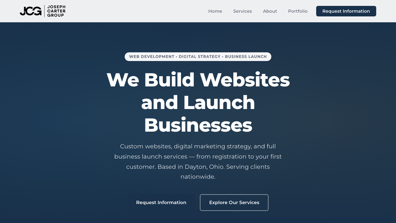
The JCG home screen supports the web-development line as the clearest example of brand, build, and conversion structure working together.
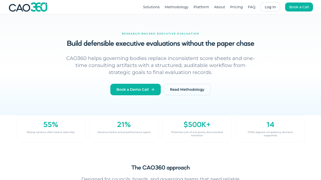
CAO360 gives the digital line a usable example of message hierarchy, interface discipline, and product-forward structure.
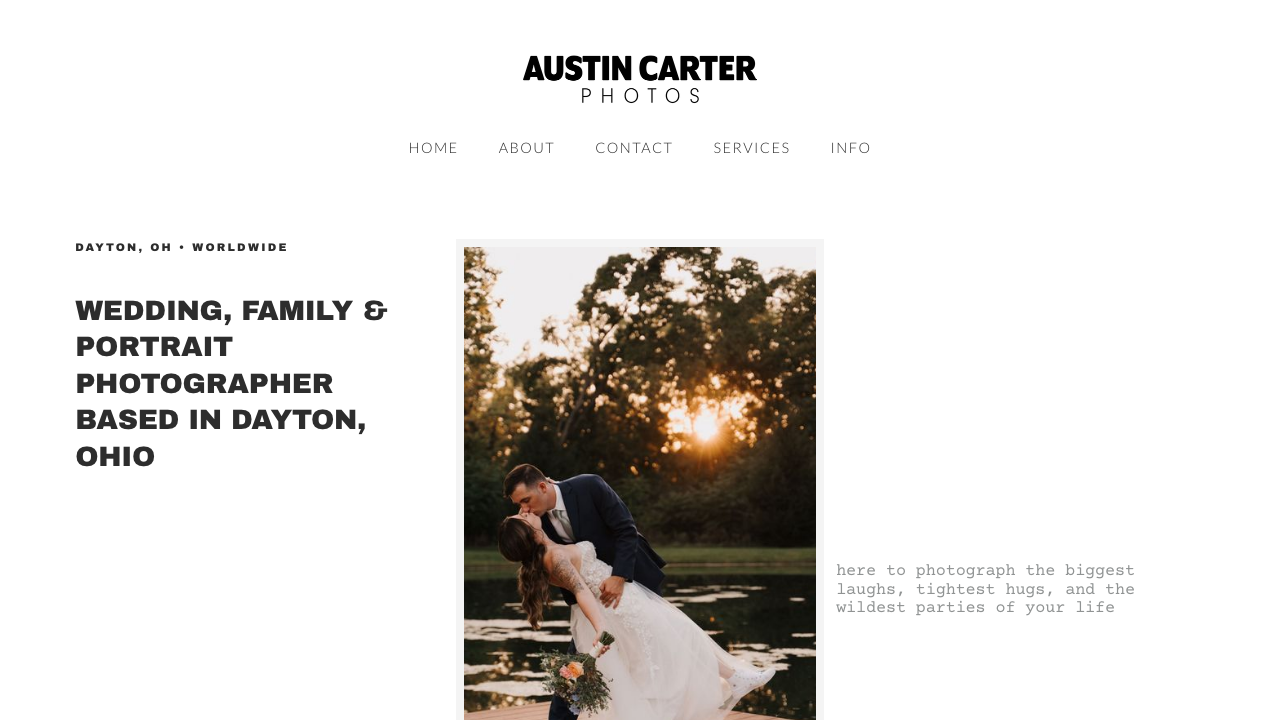
Austin Carter Photos remains a strong reference point for launch-ready presence, service packaging, and polished founder-facing execution.
The older icon set still works as a lightweight secondary asset system for cards, chips, and supporting brand moments.
Only the service lanes get more visible color separation. The broader site should still feel like one boutique firm.
The About page remains the benchmark for restraint, founder-led credibility, and overall JCG polish.
The pages should feel intentional and modern, but the service structure still needs to be legible within a few seconds of landing.
Use the services landing to pick the right line, then go deeper on the product page or the matching FAQ page.